Our Designers’ Favourite
Posted on 10th July 2019
This week’s favourite website was created for Jacob’s Finest
Jacob’s Finest is a family-run business that produces vegan falafels in a variety of flavours. These are available for sale to delis, restaurants, and shops. There was an existing website for the brand, but this was outdated and uninspiring, so a new design was required to help the business garner interest from potential buyers and build its reputation as a supplier of healthy, artisanal food.
The main requirement was for the new website to have a rustic feel, with a neutral colour palette and an emphasis on wholesome, natural ingredients. This led the design team to create the site in an array of muted brown tones, with plenty of patterned backgrounds and rough edges to heighten the earthy quality of the design.
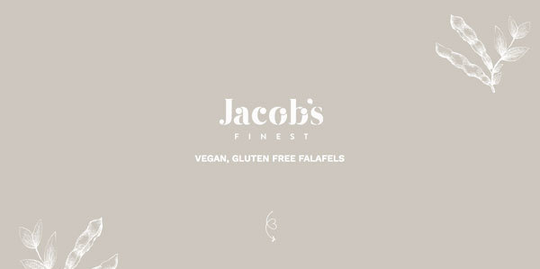
When visitors first land on the home page, they are welcomed by a full-screen banner featuring the company name against a plain background. This aids with brand awareness and adds a premium feel to the site, with the simplicity of the design highlighting the key message that the falafels are made with all-natural ingredients. This banner also contains an animated arrow encouraging visitors to scroll down, as well as several botanic illustrations.
These illustrations are a subtle way of further differentiating the products on offer – falafels are typically made with either chickpeas or fava beans, and Jacob’s Finest use UK-grown fava beans for all their creations. The illustrated beans therefore help to inform potential buyers of this detail straight away. They also reinforce the organic nature of the falafels, with additional illustrations of other ingredients dotted throughout the site.
Typography also plays an important role within the design, with a combination of bold fonts and script style typefaces ensuring that every heading stands out from the page and commends attention.
The end result is a professional website with a warm, authentic, and unique look and feel to it, providing Jacob’s Finest with an engaging online presence to grow their business with.
The main requirement was for the new website to have a rustic feel, with a neutral colour palette and an emphasis on wholesome, natural ingredients. This led the design team to create the site in an array of muted brown tones, with plenty of patterned backgrounds and rough edges to heighten the earthy quality of the design.
When visitors first land on the home page, they are welcomed by a full-screen banner featuring the company name against a plain background. This aids with brand awareness and adds a premium feel to the site, with the simplicity of the design highlighting the key message that the falafels are made with all-natural ingredients. This banner also contains an animated arrow encouraging visitors to scroll down, as well as several botanic illustrations.
These illustrations are a subtle way of further differentiating the products on offer – falafels are typically made with either chickpeas or fava beans, and Jacob’s Finest use UK-grown fava beans for all their creations. The illustrated beans therefore help to inform potential buyers of this detail straight away. They also reinforce the organic nature of the falafels, with additional illustrations of other ingredients dotted throughout the site.
Typography also plays an important role within the design, with a combination of bold fonts and script style typefaces ensuring that every heading stands out from the page and commends attention.
The end result is a professional website with a warm, authentic, and unique look and feel to it, providing Jacob’s Finest with an engaging online presence to grow their business with.
Tagged as: Case Study
Share this post: